Mobile App
Movie Scape is local suburban movie theater that strives to make each film they show as
captivating and comfortable as possible for their viewers. The theater is targeting young
families that want to go watch films together after work and school.
Buying a ticket in-person can take a long time and you don’t know which seats you’re
getting. The goals is to design an app for the movie theater that allows customers to purchase
tickets online and have a seat ready for them when they arrive.
UX designer leading the app and responsive website design from conception to delivery.
CConducting interviews, paper and digital wireframing, low and high-fidelity prototyping, conducting usability studies, accounting for accessibility, iterating on designs, determining information architecture, and responsive design.
May 2022 to September 2022
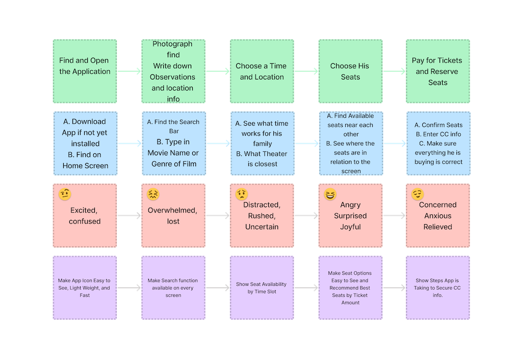
I conducted interviews with a variety of local residents that have frequented the theater
at least once in the prior month. A primary user group identified through research were
families that wanted to go see a movie in-person, but wanted to guarantee they could have
seats next to each other before going to the theater.
While this was one factor
in deciding whether to buy a movie ticket, research also found that movie-goers also care
about price of ticket, previous reviews of the film, and speed of getting to the theater.
Making this user journey map gave me the insight for several features I wanted to included in my design like a monthly challenge, AI Insect identifier, and a geolocation pollinator tracker to make finding pollinator species easier.
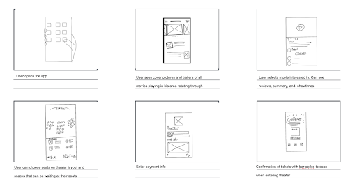
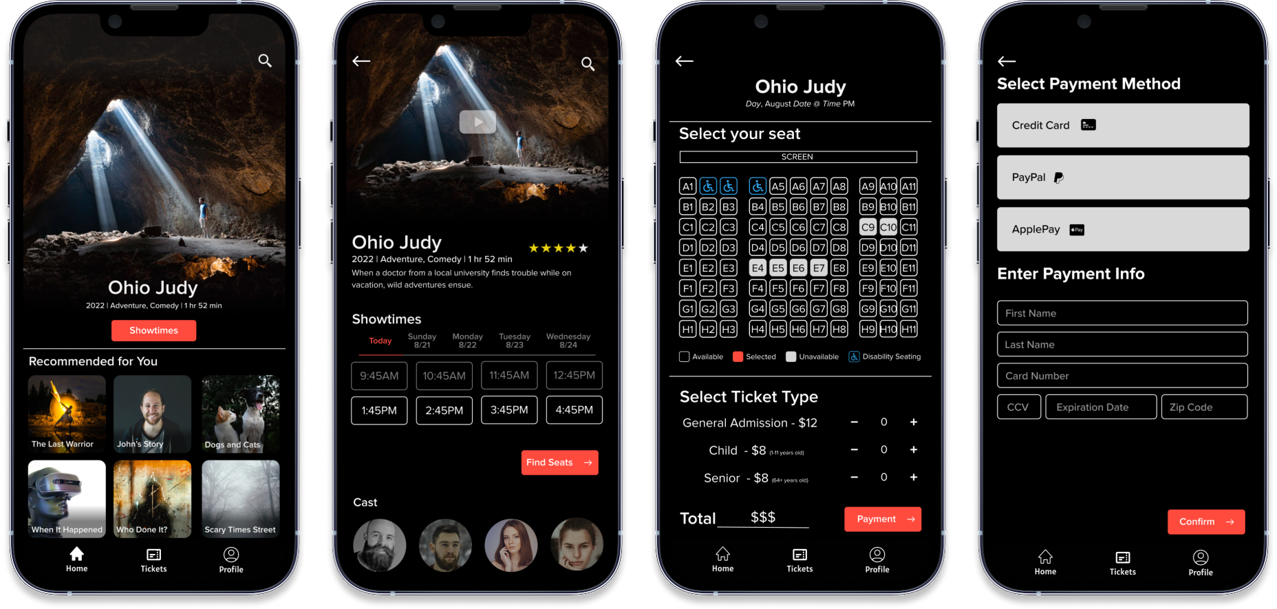
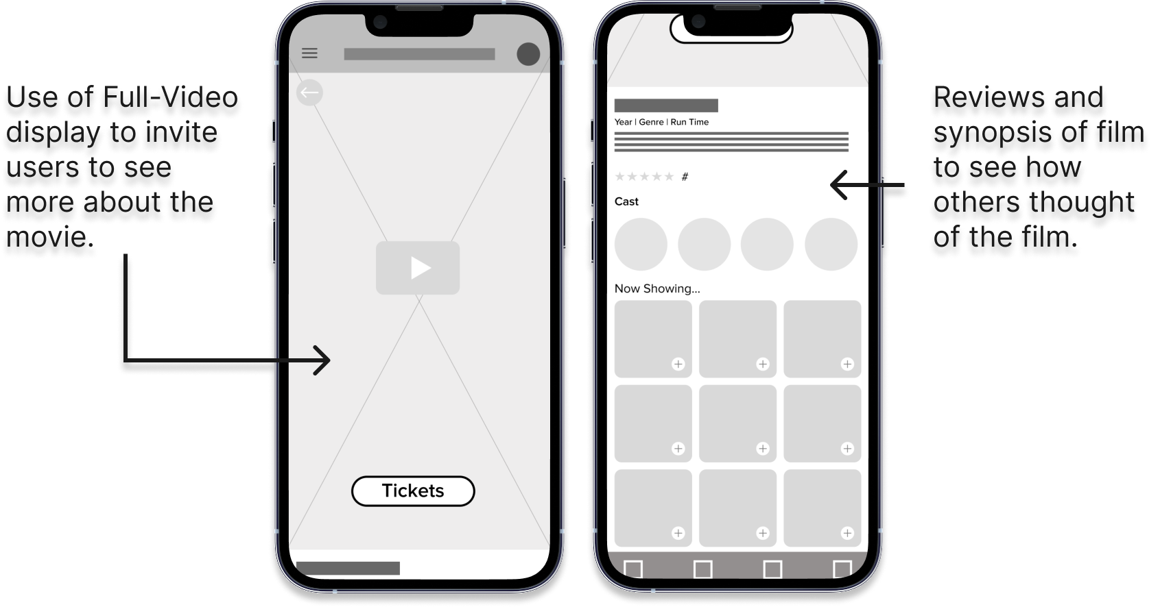
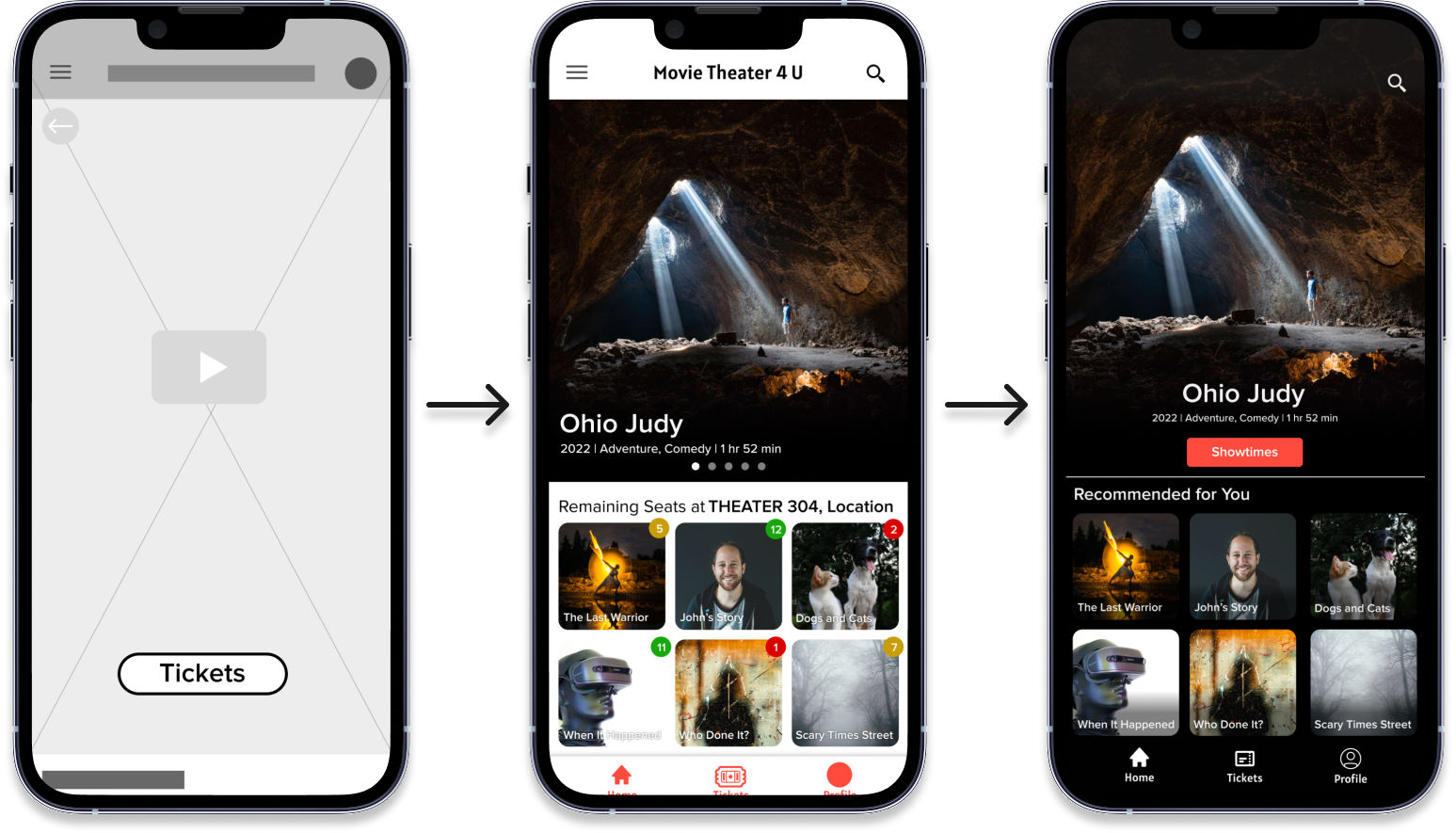
The paper wireframes initially created showed a user’s journey from the home page of our movie theater app to confirmation of a purchased ticket. I made sure to include Video Movie Trailers and Reviews so users could learn more about the film before deciding to buy.
Using the Lo-Fi Prototype, a few user frustrations emerged such as there were not enough ways to pay, people noted theaters might have different ticket prices, and some users had no interest in "remaining ticket feature" that showed the number of seats available for a show.
Through testing the app with several movie patrons, I learned a few aspects of the app that could improve the experience for people with visual imparments, as well as every other user of the app. A few key changes were creating icons to help make navigation easier, adding seat markers for those with disabilities to the seat selection design, and updating the background to a more contrasting color with the main text for claity.

I’ve learned that even when you think you may have everything covered, feedback from others
will help bring new ideas and better design with each revision. The usability studies were
a great opportunity to see how others interact the designs I have created. I was surprised
several times during the study to learn that an idea that I had wasn’t actually all that
helpful after all and a much simpler solution would have worked. For example, I thought being
able to see how many seats were left for an upcoming film would be a cool new feature that
movie-goers could use to grab the last tickets fast! However, many people that tested the
app didn’t care too much about that feature and it actually may have been a turn-off since
it looked like the movie was going to be crowded.
Over all, creating this movie theater ticket buying design was a fun experience. I can see
how this design can be incorporated in other products like streaming services. That is
something I’d like to try to design going forward.